
How to Read a Valorant Settings Menu Without a Preset
Understand toggles, sliders, target filters, key bindings, and saved configurations before interpreting a menu screenshot.
A settings menu is easier to read when you treat each control as a sentence. The label names the subject, the value describes the selection, and the surrounding section explains the context. This walkthrough follows a menu from its main groups to its saved profiles. It focuses on understanding controls and keeping a clear reference, rather than collecting isolated numbers from screenshots.
Take a first pass through the sections
Begin with the section headings. On the Elite inventory, player visuals, world visuals, aiming options, and miscellaneous controls form recognizable groups. Note where each group begins and which controls belong beneath it. This first pass creates a map of the interface, so a later question can name a location as well as a label.
Keep a short section index instead of copying every setting immediately. For example, write player information beside health and shield controls, world information beside ability and Spike entries, and configuration beside save and load. If a control appears in an unexpected tab, preserve its exact name. Menu organization provides a route through the interface; the individual description explains the control itself.
Toggles describe states
A toggle selects an enabled or disabled state for a named function. Read the function name and any nearby dependency together. The distinction matters when a panel contains a master switch alongside switches for individual subcategories. Document the state with the full label so another reader can tell which part of the panel your note concerns.
Avoid abbreviating several switches to a single word such as visuals. A note saying “player health enabled” identifies a specific item, while “visuals enabled” could refer to a whole tab. For documentation purposes, the exact label is more useful than the color of the switch. Color can change with a theme; the label continues to identify the option.
Sliders need units and direction
Record a slider as label, value, unit, and meaning. A distance control may describe a measurement boundary, while a font-size control concerns text presentation. A smoothness control has its own scale. Keeping the unit beside the value prevents an interface-specific number from becoming an unexplained recommendation in your notes.
Direction also matters. Read how the documentation describes movement toward either end of a scale. A number called speed and one called smoothness can belong to different definitions, even when both are shown beside the same aiming group. The related FOV and smoothness reference works through the numerical side in more detail, including the difference between angular and screen-based measurements.
Selectors describe a choice within a set
Filters, target-point selectors, and style selectors choose among named options. Start by identifying the subject of the set. A target-point entry concerns a point on the model. A box-style entry concerns presentation. A category filter concerns which group is included. Write that subject beside the selected label rather than recording only the label’s position in a dropdown.
If a menu changes the order of its entries, a note saying second option becomes difficult to interpret. A note containing the actual option name remains readable. This is especially useful when comparing two screenshots from different versions. Copy the words and the section heading, then add the version reference. The relationship between the selector and its subject is what makes the record useful.
Key bindings combine an input and an action
A binding identifies an input assigned to an action. Document both sides. The key name tells you what input the interface expects; the action description tells you what changes when that input is used. Keep any stated hold or toggle behavior in the same note because it describes how the action persists.
The Elite inventory describes a combat-mode hotkey that hides ability and trap ESP. That wording identifies the affected categories. Keep it intact when making a menu reference. If several actions have bindings, list them separately so the same key label is never detached from its purpose. This also helps when asking about an apparent overlap between two documented bindings.
Drawing options are a distinct group
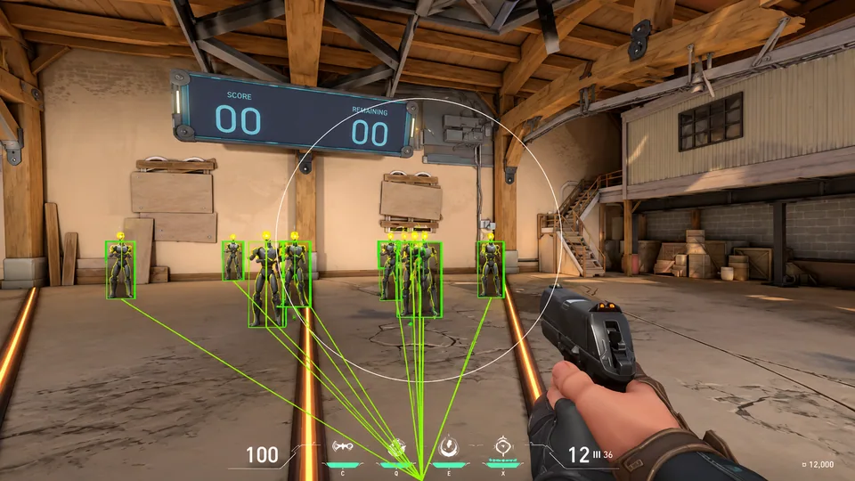
Draw FOV and draw target line are visual references in the aiming inventory. Their labels describe something drawn on screen. Put them beside the selection and movement controls in your reference, but identify their role as display. This produces a clear map of what the panel contains: conditions, values, selectors, bindings, and illustrations.
The same approach works for player markers. A distance value describes information, a box describes a presentation, and a font-size option changes text. Naming those roles makes the panel understandable even to a reader viewing it for the first time. A screenshot becomes much more useful when a short legend explains which labels concern information and which concern appearance.
Profiles store a collection of choices
Create, save, load, and unload concern the configuration lifecycle. A good profile reference records a name, purpose, application version, and the groups included. Use names that describe the collection rather than a vague phrase such as latest settings. Clear names make the record easier to find when reviewing a release or preparing a documentation question.
Keep a simple change note when editing a profile: which group changed and why. The note can be brief, but it should identify the actual controls. If a file contains private tokens or account data, keep that content outside a public example. A focused list of relevant settings is enough for most menu-definition questions and avoids sharing unrelated parts of the collection.
Turn an unclear label into a precise question
Finish the walkthrough by choosing one control and describing it completely. Name its section, full label, current displayed value, unit, and the sentence in the documentation you are reading. Then ask for the specific missing detail. This gives the recipient a concrete subject and reduces the chance of receiving a broad answer about the entire menu.
For example, a question about a distance limit should identify whether it belongs to player markers or world markers. A question about a selector should name its set of choices. A question about a binding should name the action. Use the module comparison guide when you need to move from individual controls back to the full product inventory.
Walk through a player-information panel
Start with a panel containing a player-category switch, several information labels, and presentation controls. Read the category switch first and identify the group it concerns. Then separate the values from the styles. Health, shields, equipment, and distance belong to the information side. A box, font size, or line style belongs to the presentation side. This produces a clear map of the panel before any numerical details are added.
Next, connect each presentation control with its subject. A font-size entry may concern text in the panel, while a box-style entry concerns the boundary around the subject. Put the exact relationship in your notes. A reader should be able to distinguish a label’s content from its appearance without comparing several screenshots or guessing which nearby control the caption describes.
Add the unit for a distance entry and preserve the distinction between the displayed distance and its maximum-distance control. The first is a value attached to a subject; the second is a boundary defined by the menu. Keeping the two on separate rows makes the panel easier to explain because both the information and the control governing its scope remain visible in the reference.
Finish the walkthrough with a short legend. Name the subject, the information values, the presentation choices, and the relevant boundary. This gives the panel a complete explanation in ordinary language. It also supplies the vocabulary for a focused question, such as which text the font-size option affects or which category a particular distance control belongs to.
Walk through a world-information panel
A world panel can contain object categories, icons, distances, and event information. Begin with the object categories named by the inventory. Keep ability markers, trap markers, and objective information in separate groups. Then attach the presentation choices to their respective subjects. An icon and a distance can describe the same object, while an event label concerns another part of the scene.
For an objective entry, preserve the event in the description. Progress, duration, and remaining time are different kinds of values. Read the full label and keep its unit or reference beside it. A caption that says objective timer is less specific than one that names the actual event and value being discussed. This is especially useful when several values occupy the same part of an illustration.
Review any per-character customization within its stated group. Keep the character category, marker category, and presentation option together. This makes a later comparison manageable because the customization is attached to a defined subject. A long list becomes easier to navigate when each option has an address in the panel instead of appearing as an isolated feature name.
Distinguish a saved profile from a working note
A saved profile is the application’s collection of configuration values. A working note is your explanation of that collection. Keep them separate. The profile serves the interface, while the note serves the person reviewing the settings. A useful note names the profile, application version, purpose, and groups included. It can also point to a small change log when the collection is revised.
Use a naming pattern that sorts predictably. A version, purpose, date, and revision suffix are easy to scan in a folder. Put the full profile name in the working note so the two records remain connected. A vague name such as newest settings becomes difficult to interpret after another revision appears, while a dated name preserves its place in the sequence.
Keep the reason for a revision close to the changed group. A note about label size belongs with presentation; a note about a renamed selector belongs with that selector. This structure lets another reader understand the revision without comparing two complete files line by line. It also keeps the explanation compact enough to maintain after several updates.
Read dependencies in the order they are written
Some descriptions introduce a condition before explaining a control. Preserve that order in your reference. Read the condition, the affected control, and the resulting action as one connected passage. This helps distinguish a prerequisite from a separate setting elsewhere in the panel. The wording around a control often supplies context that its short label cannot carry by itself.
When preparing a question, quote the relevant condition and the control name together. Add the application version and the section heading. The recipient can then identify the passage without searching an entire configuration. A focused reference is particularly helpful when several controls share a similar word but belong to different groups within the interface.
Compare two versions without losing the old layout
Create a small version comparison with columns for old label, old location, current label, current location, and documentation reference. Add a row for each entry that changed. This gives an older screenshot a useful connection to the newer panel. It also makes it easier to distinguish a renamed control from a control that simply moved to another section.
Keep the original screenshot beside its version label. Add annotations to a copy rather than editing away the original panel headings. A comparison becomes easier to review when both versions retain their context. If the purpose of the comparison is a documentation correction, quote the sentence that needs revision and identify the current location in a separate field.
Prepare a compact menu reference for another reader
Arrange the final reference in the order a person encounters the interface: section heading, category controls, information values, presentation options, and configuration actions. Put units beside numbers and actions beside bindings. This order mirrors the reading task and keeps the reference useful even when the person has not seen the menu before.
Use a short explanation for each unusual term and a link to a focused guide when more detail is needed. A menu reference can remain concise while still connecting to numerical examples, indicator legends, and the wider inventory. The aim is to give each control a clear role and a clear location, so the document supports a specific question instead of becoming another list of repeated labels.
Review the reference for ordinary reading problems
Check whether several controls have been shortened to the same word. A label such as distance may need its player or world context. A label such as aim may need its selection, movement, or display role. Restore those distinctions wherever the note becomes ambiguous. Clear naming is especially useful when the reference is read later without the original screenshot open beside it.
Finally, check the sequence. A reader should be able to find the group, identify the control, understand the value or choice, and locate the supporting explanation. If those steps are clear, the reference is doing its job. Save it with the profile or screenshot version it describes, and update the relevant row when a later release changes the interface.
Keep the reference useful over time
Review the document when a label, group, or profile format changes. Update the affected entry and add a revision note containing the application version. Leave unrelated controls alone so the change remains easy to review. A small, targeted revision is easier to understand than replacing the whole reference after every update.
When archiving an older version, retain its date and the associated image names. The archive then explains the interface shown in an earlier conversation. Keep the current reference in a clearly named location and use the archived copy only for that historical context. This arrangement gives both versions a purpose and prevents an older screenshot from being detached from the menu it originally described.